
The Brief
We were tasked with designing a branded AI assistant for Toyota.

Striking a balance between forward-thinking design and brand recognition through icon exploration.
With flexibility beyond Toyota’s standard brand system, we explored a range of shapes and colors for the chat CTA.

With Toyota’s approval to step outside of the usual brand system, we began experimenting with new visual directions. This gave us room to test gradients, iconography, and other treatments that could capture attention and signal innovation.
Exploring the Full Scope of the Chat Experience — From Visuals to Interaction
We created a series of mockups to explore how the icon and full chat experience could look and function. These concepts helped us test different visual directions, interaction patterns, and layouts, giving us a better sense of how the chatbot could live within Toyota’s ecosystem.


Landing on a Look: Defining the Chat’s Visual Direction


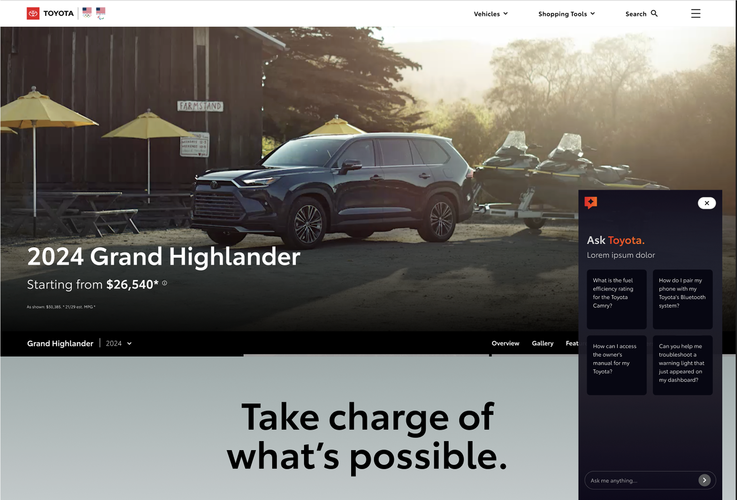
After presenting a range of icon styles and color schemes, we aligned on a bold, bright gradient that stood out against the white background of TCOM. This choice gave the chatbot a distinct presence. With the direction set, we shifted into production, creating the full set of assets needed to bring this new look to life.
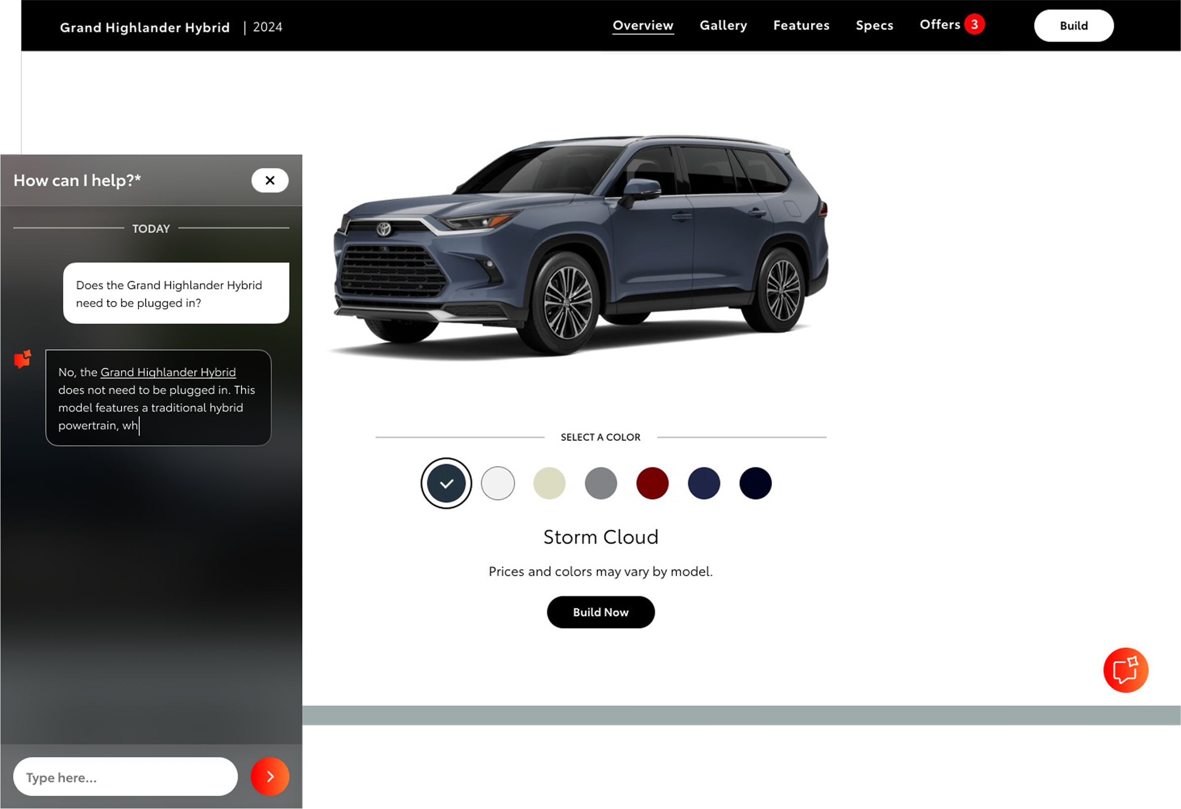
With the iconography and color scheme finalized, we shifted focus to applying the new visual system to existing TCOM pages and began designing the chat window experience.
Designing Flows and Components for the Chat Experience
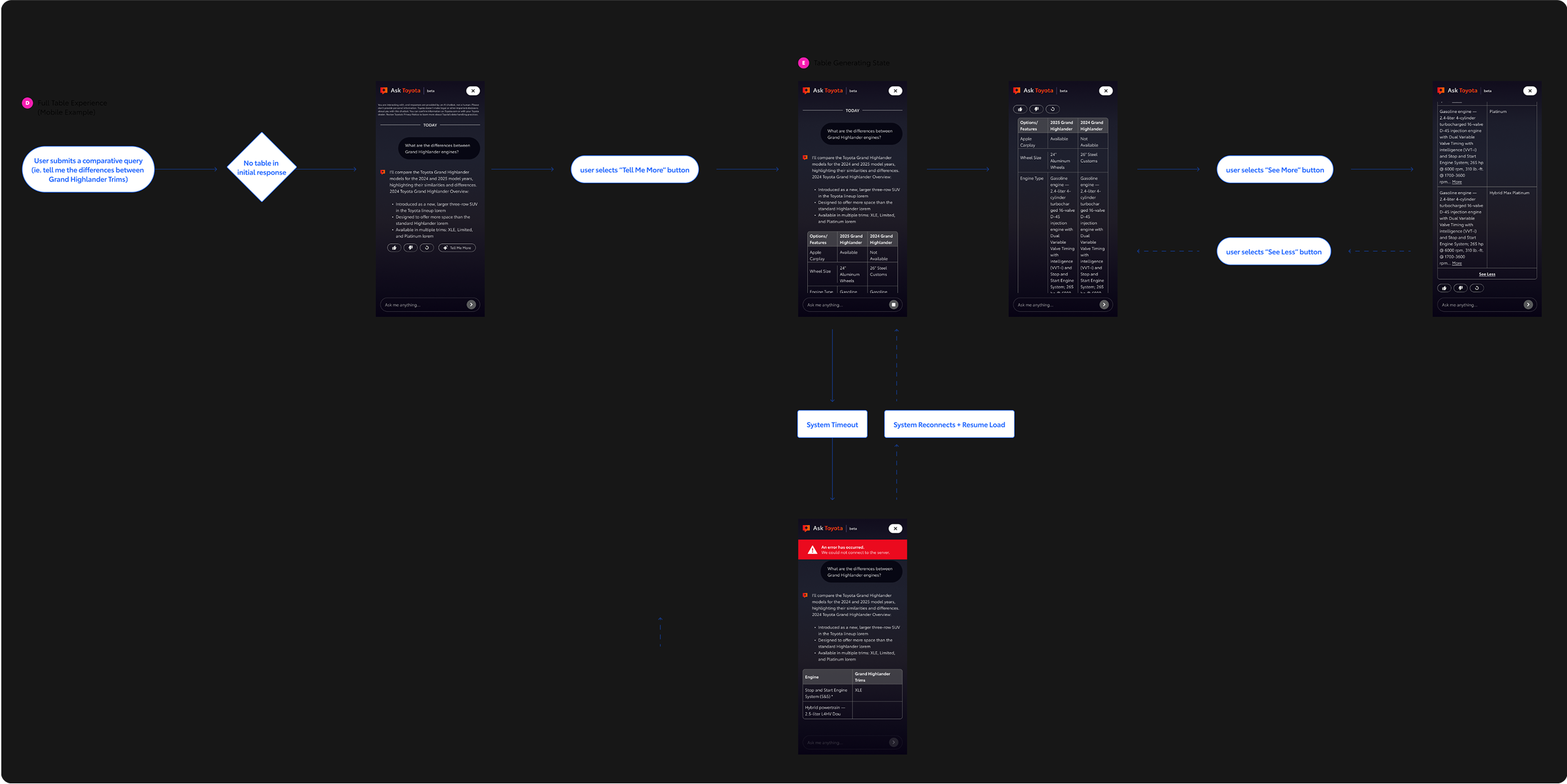
To understand all of the screens and components we would need, we created flows that demonstrated the chatbot’s key features, including how image galleries would appear, how errors would display, and how comparative tables could be integrated.
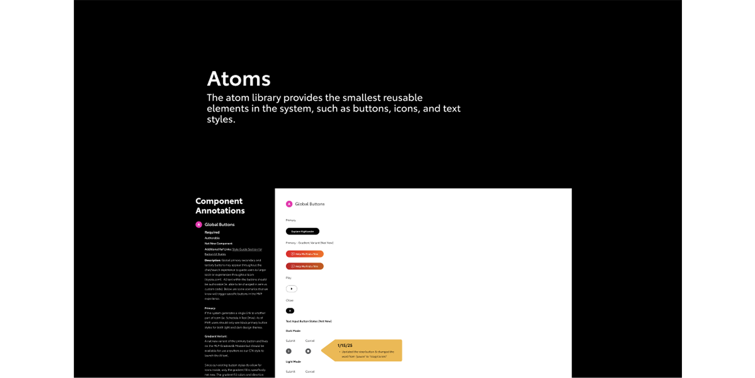
We built out components and screens after identifying the key features we wanted to include in the chatbot. Following the atomic design method, we broke components down into smaller parts, making the system flexible, reusable, and easy to scale.
Refining and Completing the Chatbot Experience
To draw attention and bring energy to the page, we animated the chatbot icon as it loaded in.
The chatbot was designed to load in from the right side of the page, minimizing disruption to the main TCOM experience. To ensure flexibility across different backgrounds, we also introduced a light mode option, giving the chat window a seamless presence within the broader interface.
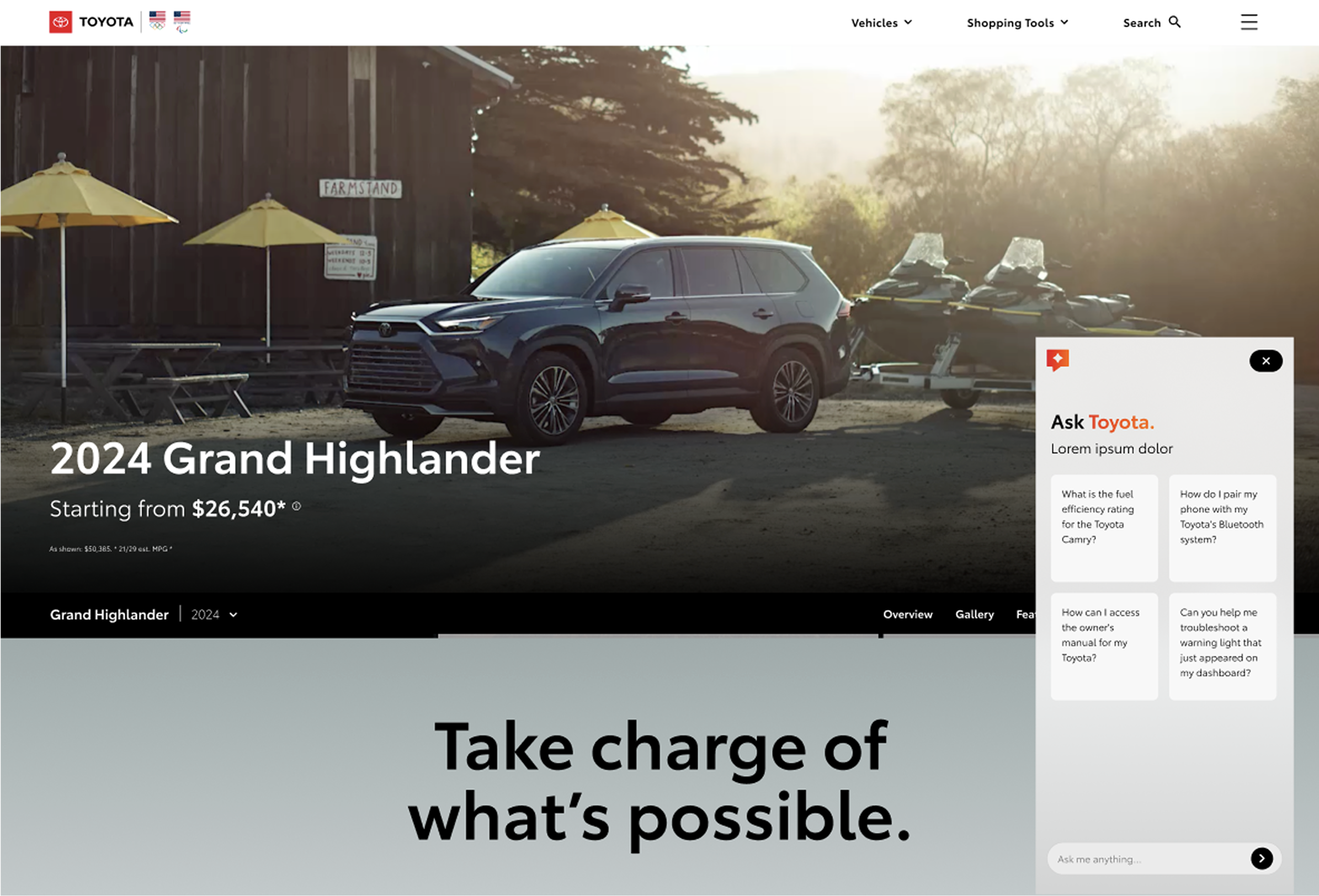
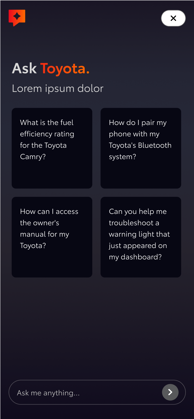
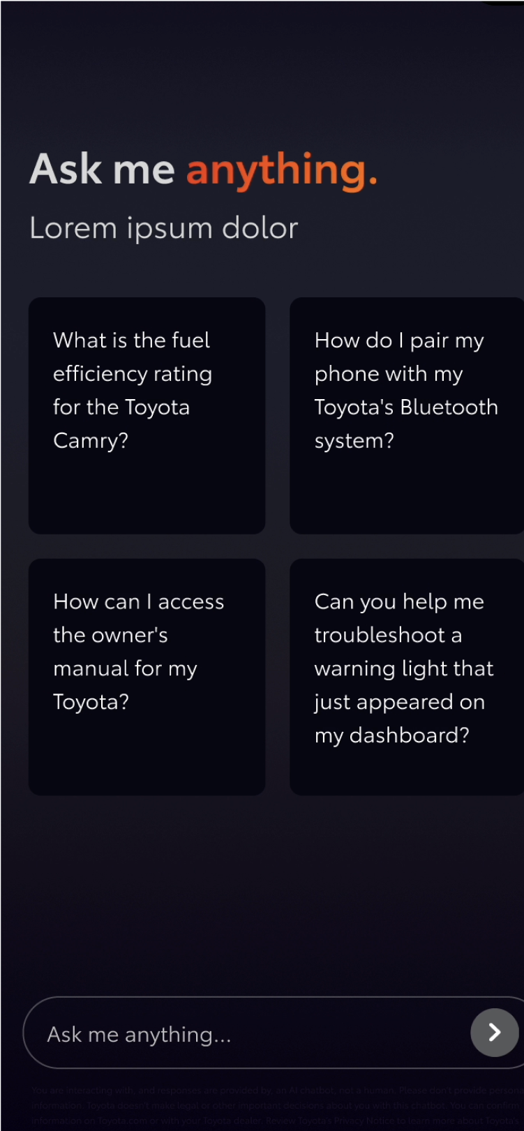
It was important to keep the AI chat window as tight as possible, since clients were concerned about it infringing on other TCOM experiences.
We created prompt cards to help users jumpstart their journey or show examples of the types of questions they could ask. Given the small window size, we restricted copy in the prompt cards to a set character count.
“Normality is a paved road: It’s comfortable to walk, but no flowers grow on it.”
- Vincent Van Goh


