The Brief
Build a centralized platform for Toyota’s brand guidelines, design systems, and assets — accessible to both internal teams and external partners.
Toyota needed a centralized hub to bring its brand guidelines, assets, and design system under one roof. The problem was clear: assets lived in too many places, and there was no single source of truth. With the scale of a brand like Toyota, it was essential to create a concrete space that not only organized those guidelines but also showcased the company’s design investment.
Explore the key elements of Toyota’s brand identity through high-level sections that highlight our approach to visual design, dynamic experiences, and sonic branding. Each section offers insight into how we bring the brand to life across multiple touchpoints.
Building a Brand Library and closing the gap
The first version of the Toyota Brand Hub was built without reusable, authorable components, which limited flexibility as the site grew. To support its expanding volume, we introduced a modular system that could scale efficiently.
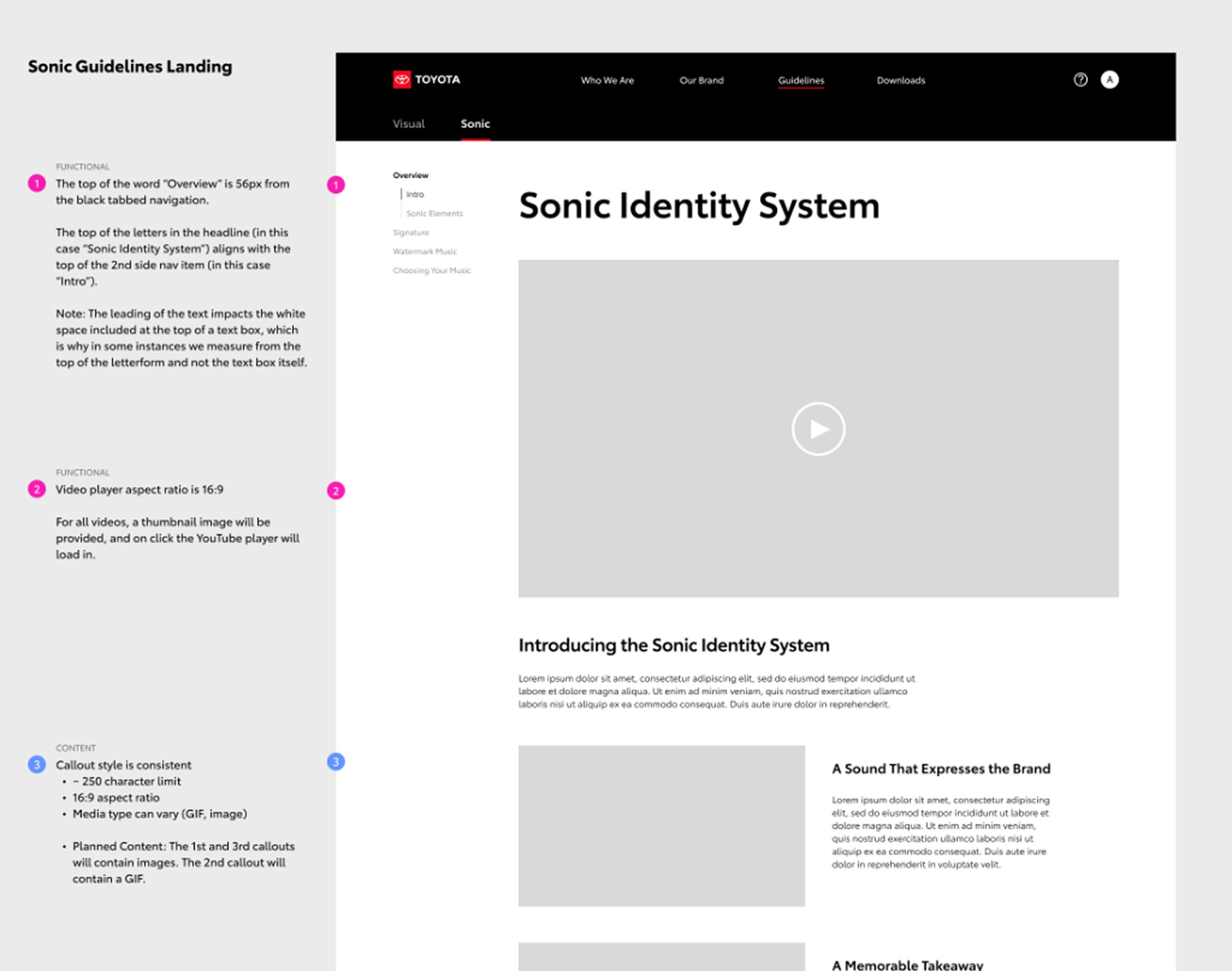
As part of the overhaul, we established a shared visual language by defining modular components in Figma that could be repeated across pages. We extended this system into annotated page layouts and streamlined, easy-to-scan handoff files. In parallel with ongoing collaboration with AEM developers, we introduced new components to support the updated brand and refined existing ones to align with the new system.
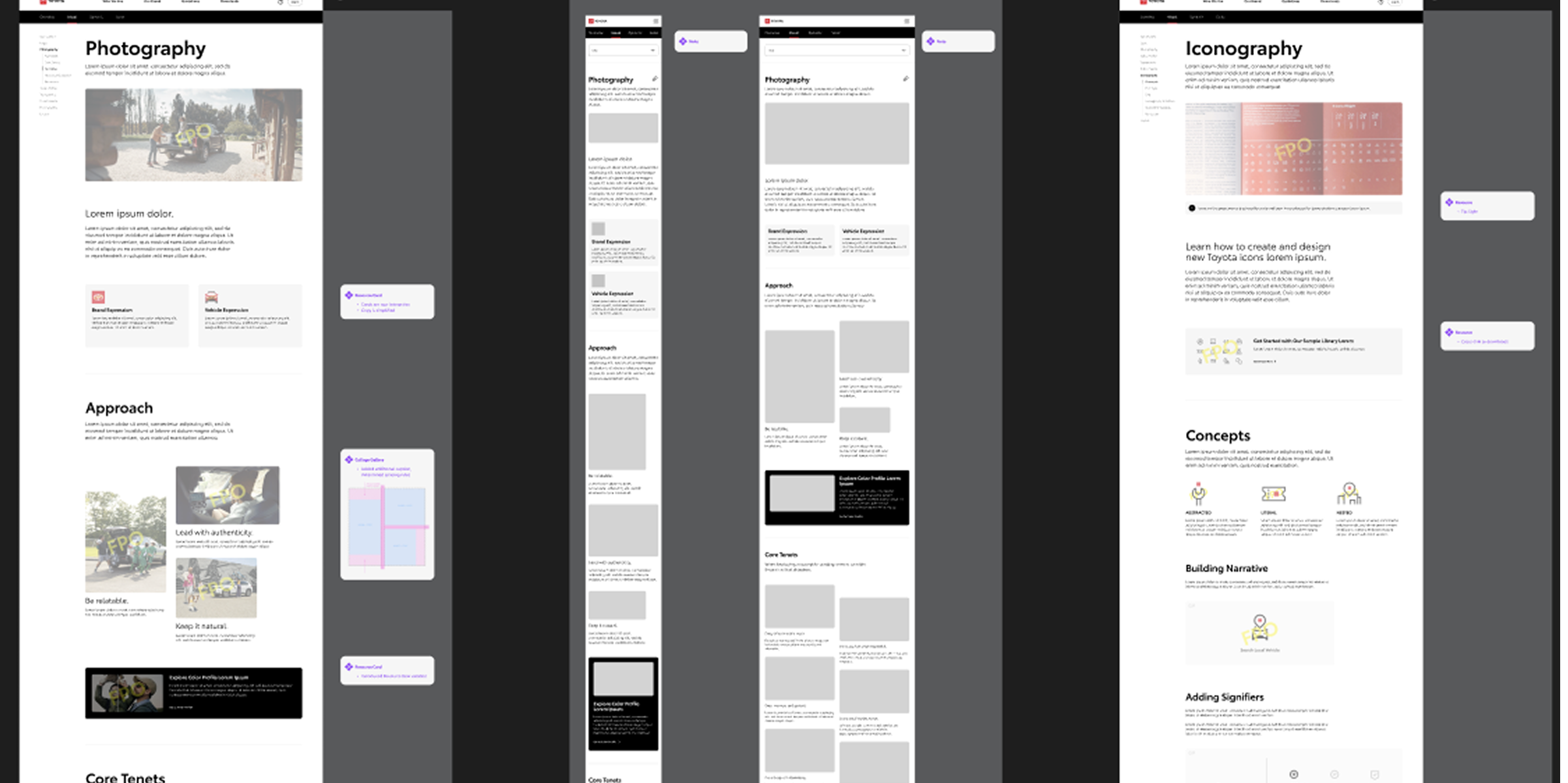
To build on the component library, we created annotated page layouts that showed how each module worked in context. These layouts linked back to the original component annotations when deeper detail was needed, giving developers and designers a clear path from high-level structure down to granular specifications.
Using the component library to build something Unmistakably Toyota
Toyota’s brand colors were presented as usable components with technical values for accuracy and real examples of how they create hierarchy and clarity. Functional applications of white, black, gray, and red showed the palette in action, while color mode guidance ensured consistency across digital and print.

We created graphics that reflected Toyota’s branding and offered clear examples of how elements like color should feel.
Toyota’s signature colors
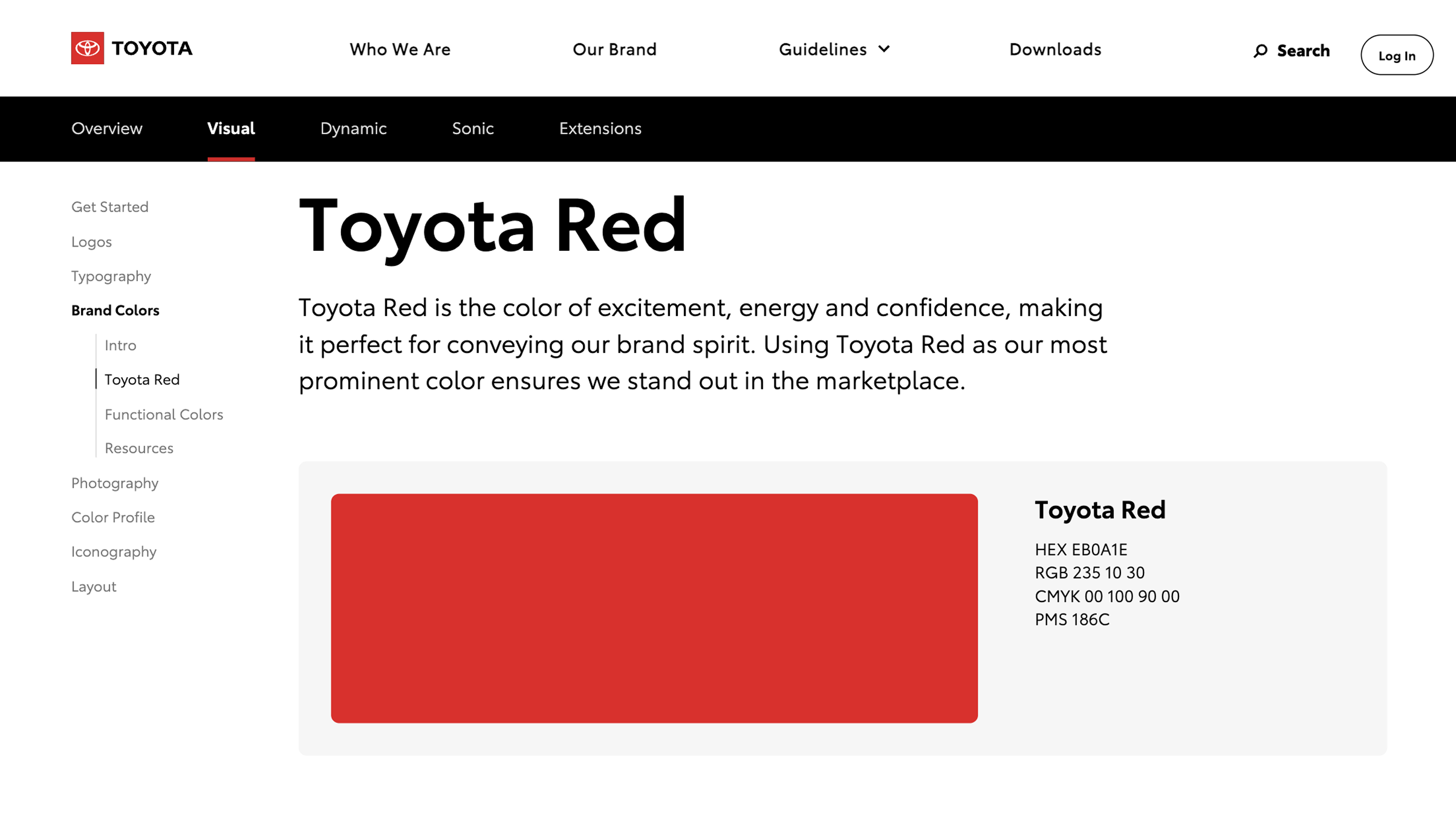
Toyota Red is the core of the brand palette. We showcased the swatch alongside its technical values in HEX, RGB, CMYK, and PMS to make it easy for teams to apply the color accurately across both digital and print.
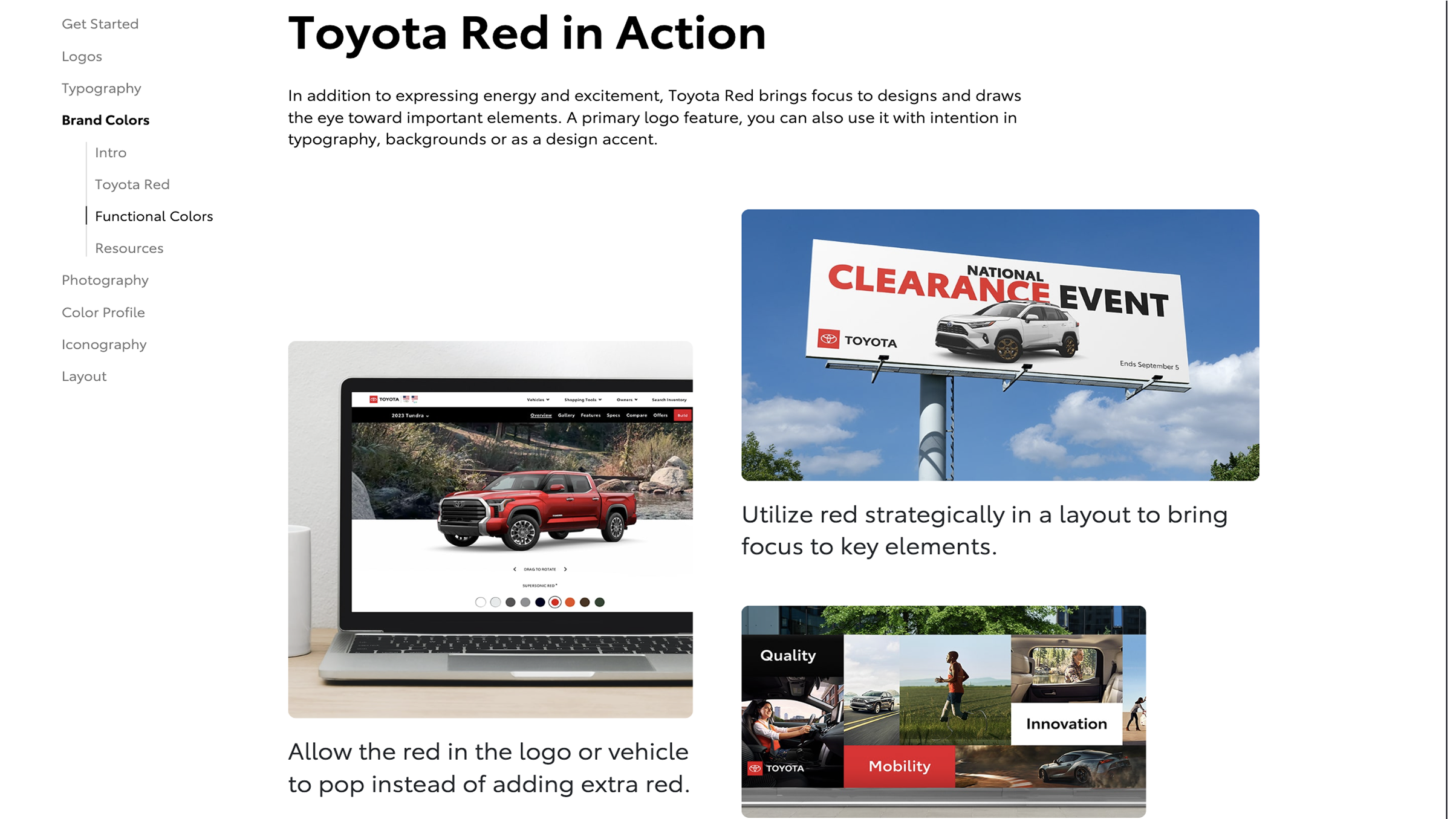
We created examples showing how Toyota Red works in real layouts, from digital interfaces to marketing touchpoints. These applications highlight its role in drawing attention and reinforcing brand recognition.
This wasn’t just about building pages and components. We partnered closely with the content team to create supporting assets, which was especially important in sections like Layout where visual examples were key to bringing the guidance to life.

When general photography didn’t quite capture what we needed, our content team stepped in to create tailored visual assets.
The Layout in Action offers inspiration for combining elements in expressive, brand-aligned ways.


Showing real-world examples was a must, but it pushed us to design components that could flex — whether they were supporting billboard imagery or fitting into a small mobile screen.
The layout page demonstrates how Toyota’s principles come to life on the live site, showing real examples of balance, hierarchy, and brand expression across different formats.

Creating guidelines for color profiles and how Toyota sets tone through color
We created a layout and flow that made Toyota’s color profiles easy to understand, showing how grading supports mood and brand consistency through real-world examples.
The color grading story continues in Toyota’s video content, highlighting consistency across mediums.
This section focuses on how light, contrast, and saturation can shape mood and help the vehicle stand out in a variety of settings.
The live site brings these principles to life, showing how color grading supports mood, clarity, and brand consistency across real examples.
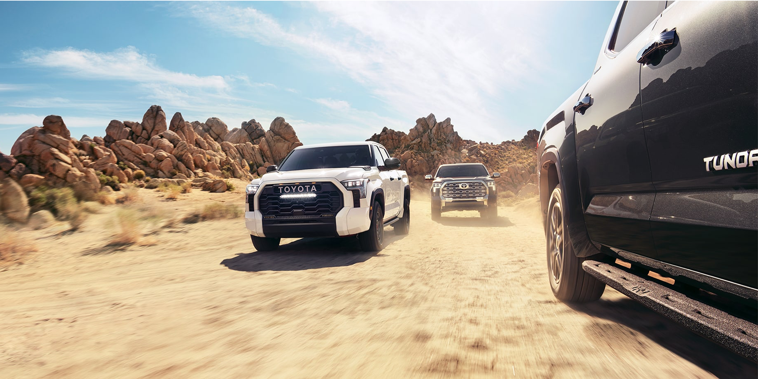
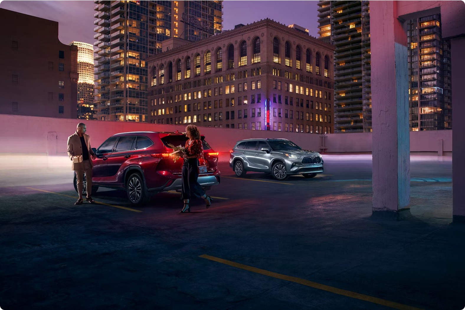
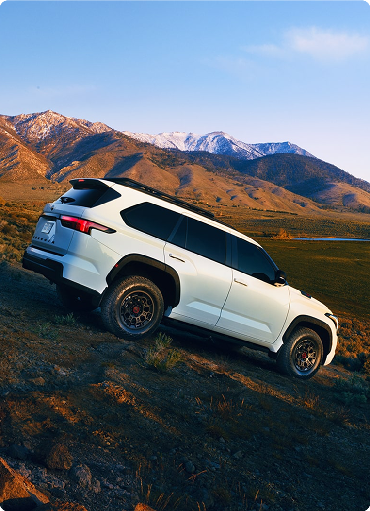
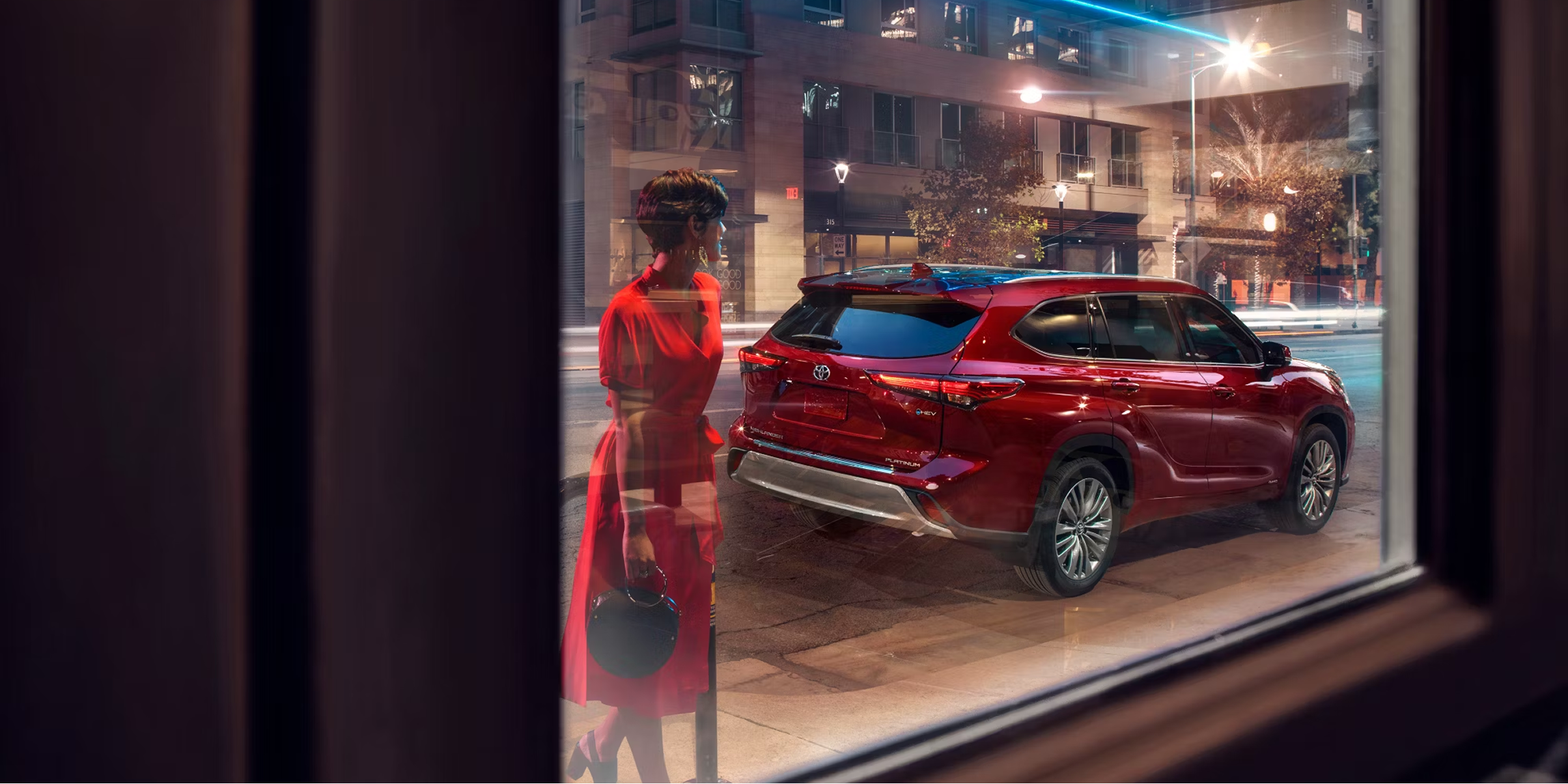
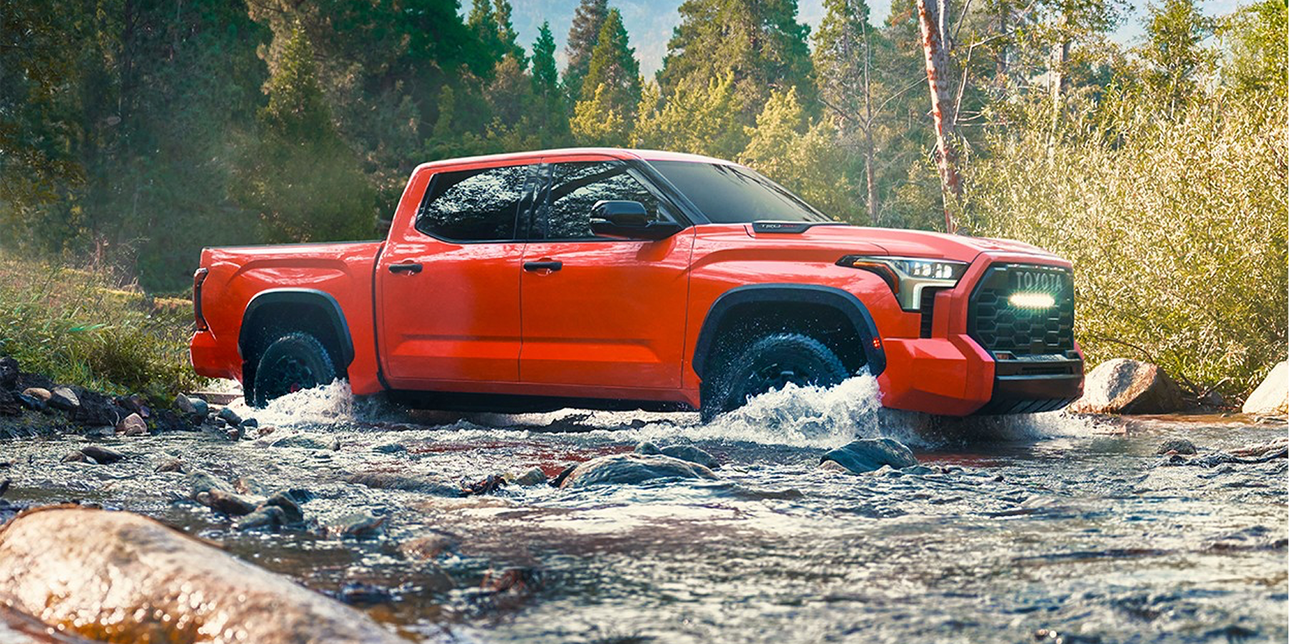
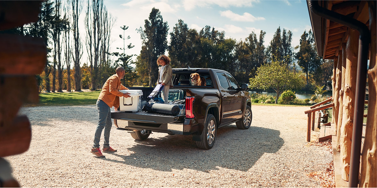
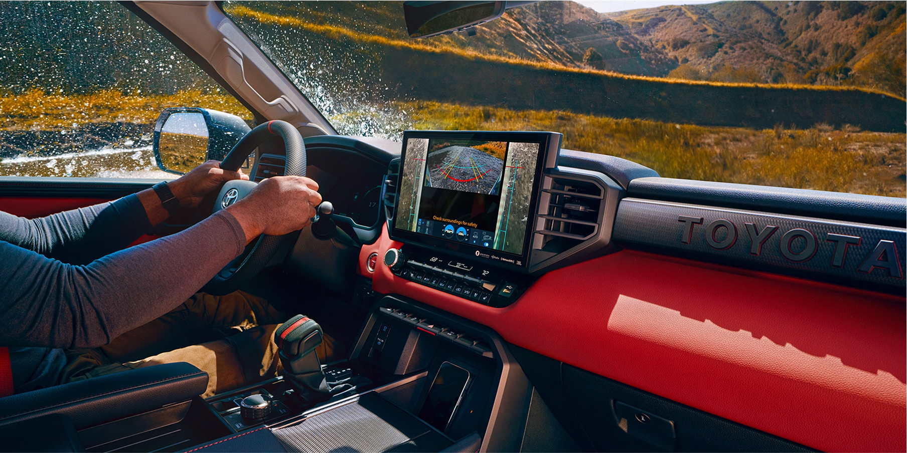
Because Toyota’s brand aims to inspire a sense of discovery, we focused on building concise photography guidelines to ensure every image aligns with the brand’s vision and narrative.
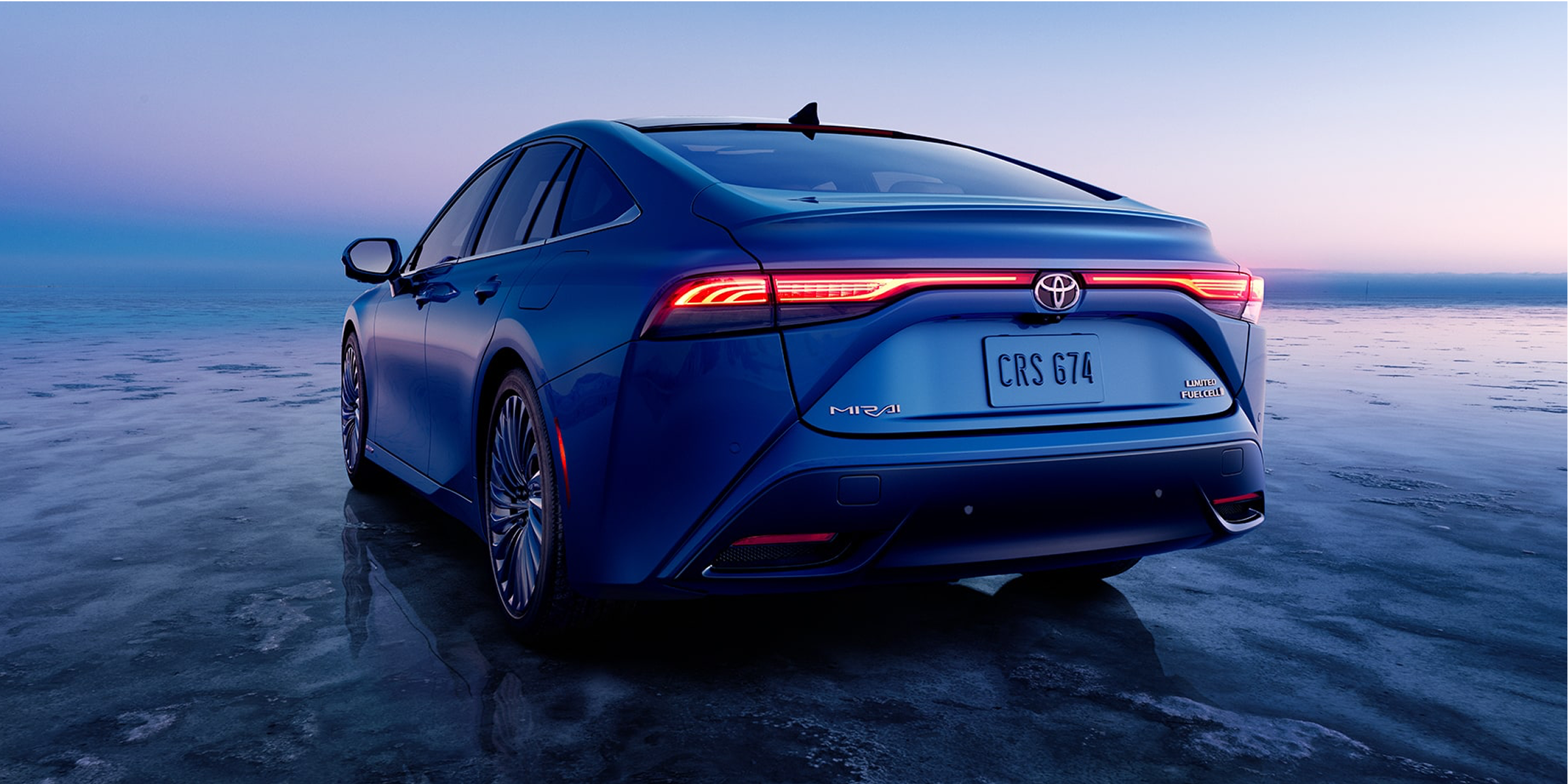
Including photos of vehicles that evoke a culture of discovery is a key tenet for Toyota.
Building out the photography guidelines was a broad challenge that took time to narrow down into something clear. We started with Toyota’s larger brand ideals and worked through how those could be expressed visually across different types of photography. Through a lot of iteration, we landed on core areas that shaped the system.
The second half introduces additional guidelines that support the core photography approach.
After defining the core tenets of Toyota’s photography, we focused on translating those ideas into usable design components and layouts. Each tenet guided decisions on composition, lighting, and subject matter, ensuring that imagery consistently reflected Toyota’s values of quality, mobility, and innovation.
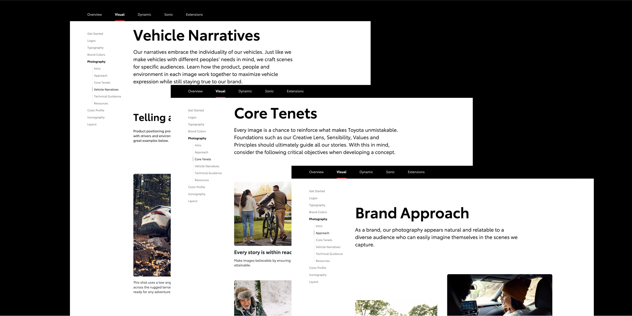
Building out the photography guidelines was a broad challenge. We started with Toyota’s larger brand ideals and worked through how those could be expressed visually across different types of photography. Through a lot of iteration, we landed on core areas that shaped the system.
We crafted components that encouraged interaction while keeping the page lightweight and easy to scroll.
“Normality is a paved road: It’s comfortable to walk, but no flowers grow on it.”
- Vincent Van Goh